Ghost Button Design Still a Thing?
For such a small design element, buttons sure are a complicated one to tackle. It makes sense, what with call-to-action buttons serving as the next step in your visitors’ path to conversion. Mess that up and you might as well say “bye-bye” to business.
Though we have a good understanding of the types of button design rules that universally work, there will be times when you’re surprised by a rogue element that performs well. Like ghost buttons.
Ghost buttons aren’t much of a mystery, despite their eerie-sounding name. They’re call-to-action (CTA) buttons for your website, like any other. The key difference is in how they look.
This Dropbox tooltip is a great example of how a traditional button looks compared to a ghost button:
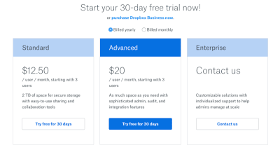
The blue button in the center is the standard flat design button we’re accustomed to. The outlined transparent buttons on the left and right are ghost buttons.
Logic would dictate that ghost buttons are no good for web design because they don’t appear to be tangible or clickable, and they’re devoid of the attention-grabbing elements of traditional buttons. Yet, research shows us that visitors don’t necessarily see them that way.
What I’d like to do today is talk about the known pros and cons of ghost button design and then delve into some case studies in order to set the record straight.
By Suzanne Scacca
Full article: www.smashingmagazine.com