Why Designers Love The Ampersand
Cheerily nuzzled above the "7" key like a pear-shaped pill bug, the ampersand is perhaps the most intriguing character on the keyboard. While all letters and punctuation marks look similar enough in abstract, the ampersand feels unique, like a shape-shifter that could transform at a moment's notice. For type designers and aficionados both, it isn't so much a character as it is a character, "usually a tirelessly entertaining one, perhaps an uncle with too many tricks," as Simon Garfield wrote in his 2012 book, Just My Type.
No wonder the ampersand attracts such endless fascination. There are coloring books about ampersands, ampersand-a-day Tumblr blogs, and a whole cottage industry of t-shirt makers working in ampersands. Perhaps the most epic undertaking of ampersand-ian tribute came in 2010, when over 400 different designers came together to create an entire font made up of nothing but distinctive and unrepeated ampersands. The project speaks to the ampersand's individuality: a font of nothing but ampersands is easy to imagine in a way that a font of only lower case "j"s could never be.
But if an ampersand feels like it can be anything, what makes an ampersand an ampersand? Where does it come from? And why, exactly, do type designers love it so much more than other characters?
EVERY AMPERSAND STARTS WITH "ET"
Ampersand design may seem infinitely variable, but no matter how stylized or abstracted, every ampersand is, at heart, an et—or Latin for "and." Some typefaces (especially handwritten-style ones) make this more obvious: it doesn't take too much squinting to see an "et" in the ampersands of Trebuchet MS, Garamond Italic, Casalon Italic, or even Papyrus. But you can see the Latin DNA of "et" even in an Arial, Helvetica, or Times New Roman ampersand, where the "e" has become a half-closed figure eight, forming the cross of a "t" with its bottom descender. And if you've ever handwritten an ampersand, chances are you've done so by drawing a loopy cursive "E," bisected lengthwise by a straight line: another stylized "et."
The first known ampersand was scrawled on a wall in 1st-century Pompeii by an anonymous graffiti artist practicing his Roman cursive. It is related, but not identical to, a rival mark created during the same time period by Marcus Tiro, a former slave of Cicero who proposed what is known as the Tironian et (or "⁊") as part of one of the world's first shorthand system. Although the Tironian "et" eventually fell out of favor—except, bizarrely, in Ireland, where it is still used in Gaelic signage today—the Latin "et" continued to gain popularity, perhaps because it wasn't tied to a larger shorthand system that scribes needed to learn in full.
Instead, by the 8th century, they had stylized the Latin "et" into a symbol that looks very much like a modern ampersand. But it would take another thousand years for the ampersand to get its modern name
AND PER SE &
Technically, the word ampersand is a mondegreen—meaning a jumble of words that is routinely misheard—created from the phrase "and per se &," itself a meaningless word salad which only makes sense in historical context.
In the 19th century, the ampersand was recognized as the 27th letter of the alphabet, right after "Z," and taught as such to British schoolchildren. At the time, it was common to refer to letters that could also be interpreted as words as per se letters: e.g. per se "A" (as opposed to article "A"), and per se "I" (as opposed to pronoun "I.") Since it stood for "and," the ampersand was the third of these per se letters, so when school children recited their ABCs, they ended it: "...W, X, Y, Z, and per se and." Get a couple generations of kids slurring "and per se and," and you get the word ampersand.
Even if it isn't today, the fact that the ampersand was once considered the 27th letter might be why it looks so uniquely at home in the middle of other letters, as is the case with AT&T, H&M, A&W, and so on. In fact, in the business world, the ampersand has uncommon status. It's the typographical equivalent of a wedding ring, used to mark permanent partnerships, like Marks & Spencer, Johnson & Johnson, Barnes & Noble, and Ben & Jerry's.
WHY DESIGNERS LOVE AMPERSANDS
Although his own partnership by ampersand flared out, Jonathan Hoefler (now of Hoefler & Co.) still loves the character. Speaking to Wired, Hoefler tried to sum up his love for the ampersand, which he says he's been known to draw "to excess." "It's always an opportunity for adventure," he says. "Even the most conservative typefaces can give sanctuary to a whimsical ampersand or two."
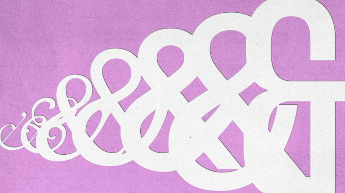
Hoefler's not alone in finding the ampersand adventurous. The character's ability to be "whimsical" even in otherwise staid fonts is one that is called out by many type designers as its unique quality. "The ampersand is the one glyph where type designers are able to let loose and be a little more creative," says Jeremiah Shoaf, a freelance designer and the editor of Typewolf, a popular blog about typefaces which uses a Baskerville ampersand for its logo. That's because ampersands are usually only used for display type—the large or eye-catching type used in headlines, signage, and advertisements—so the character can be more ornate, even in fonts that are primarily designed for text. A good example of this effect in action are the ampersands of Kings Caslon, Bookmania, Didot Italic, and Cochin Italic, all of which really cut loose and be more flamboyant than their associated typefaces.
But it's in keeping with the kitchen sink nature of ampersands that while some designers love them for their whimsy, others see only order. In an email, famed type designer Erik Spiekermann suggests the reason he loves ampersands is because their shape appeals to the mathematical bent of his orderly German mind. "I like designing them because I like designing figures, and the ampersand is like an 8 with bits added," he says. In addition to the many ampersands he has designed for his popular typefaces, Spiekermann has an unusual way of drawing ampersands in his day-to-day correspondence, where the character looks like a stylized @ symbol. He describes the fluidity of what people expect an ampersand to look like as affording designers a lot of opportunity to play around.
THE GREAT DINOSAUR OF TYPE
At the end of the day, it's incredibly difficult to succinctly define the ampersand—which is, of course, exactly what makes it so interesting. It can be almost anything you want it to be. But in an email about his fascination with the ampersand, Tobias Frere-Jones (formerly wedded by an ampersand in Hoefler & Frere-Jones, now of Frere Jones Type) comes closest. He writes:
In the history of our alphabet, the ampersand is a dinosaur.
It should have gone extinct a long time ago, but has survived nonetheless. We use it so frequently that it’s easy to forget its origin as two letters entangled, spelling out a word in Latin. The written forms of Latin had scores of contractions and other marks for abbreviation. All of those marks died alongside the Latin language itself, except for the ampersand. (And much less prominently, the "Rx" symbol we now take to signify pharmaceuticals.)
Visually, the ampersand is a loner. Thanks to its convoluted development, it has no relatives among any of the letters. And it has a strange brief to satisfy, operating on the same scale as letters but never being mistaken for one. So the type designer is left to wing it, right from the start. It’s tempting to think that the top bowl will find guidance in the figure eight, or that the diagonals can cribbed off the K or X. It never works out that way.
Usually, letters help to form one another, by setting precedents and providing contexts. But the ampersand doesn’t receive any of that support. That makes it hard to draw, because so many different shapes might look plausible at first. But it also opens an unusually large window for experimentation and risk. It’s how the designer can put on a fireworks show in this one shape, especially in seriffed italics.
In the end, the ampersand is a beautiful and uncooperative creature, one we’re lucky to have inherited.
If there is any way to summarize the ampersand, that should be it: the beautiful and uncooperative dinosaur who lives on in your fonts. May the ampersand never go extinct, and never be fully tamed.